Premium Access Entrypoints

MAKING PREMIUM VISIBLE AT THE MOMENT OF NEED
I designed a system of contextual entry points that introduced OfferUp Premium when its benefits were most relevant—while customers were browsing, buying, messaging, posting, and selling.
OVERVIEW
OfferUp Premium was not a feature that lived on a single screen. Its value stretched across the marketplace: fewer interruptions, greater trust, earlier access to listings, stronger visibility, and tools that helped serious buyers and sellers stand out.
That created a design challenge. Customers needed to understand Premium without being pulled away from the task they were trying to complete. A generic subscription page could explain the offer, but it could not create relevance on its own. The experience needed to surface the right benefit in the right moment.
I worked with product management, research, engineering, marketing, and visual design to map Premium across the end-to-end marketplace and create a flexible family of entry points. The result was a connected system that could introduce Premium contextually across multiple surfaces while maintaining one recognizable product identity.
[IMAGE BREAK — PREMIUM ACROSS THE MARKETPLACE]
THE CHALLENGE
Premium benefits could become relevant while a customer was browsing inventory, viewing an item, messaging a seller, managing conversations, building trust through a profile, posting an item, or trying to increase a listing’s visibility.
A single acquisition screen could not carry the entire story. We needed a system that connected customer pain points to Premium benefits without turning every interaction into an advertisement.
The design question became: How might we make Premium discoverable in context, communicate a specific benefit quickly, and let customers continue their original task?
[IMAGE BREAK — MARKETPLACE SURFACE MAP]
MY ROLE
I partnered closely with the product manager on product strategy, owned customer and subscription research, and designed the end-to-end flows and prototypes. I led the visual direction for Premium identity, iconography, and badging while supervising and collaborating with a visual designer on execution.
I also worked across product, engineering, research, marketing, and data on experiments, then reviewed launch and performance data with the product manager.
RESEARCH BEGAN WITH REAL CUSTOMER BEHAVIOR
Customer reviews repeatedly mentioned frustration with advertising. Research also exposed deeper marketplace problems: serious customers struggled to stand out, buyers wanted an advantage when desirable items appeared, and sellers wanted more attention on their listings.
I used OfferUp constantly myself. I went to estate sales, bought items specifically to resell, and spoke with people during real transactions. After telling them I worked at OfferUp, I asked what helped or frustrated them.
One idea came through repeatedly: the best way to get a desirable item was to see it first and make an offer quickly. That observation helped inspire Early Access, a benefit that gave Premium customers an earlier opportunity to act on new listings.
[IMAGE BREAK — CUSTOMER INSIGHT TO EARLY ACCESS]
TWO CUSTOMER MOTIVATIONS
Beat the competition
High-frequency buyers and resellers wanted earlier access to inventory, faster responses, and an advantage that could help grow a side business.
Reduce friction and establish trust
Frequent buyers and sellers wanted an ad-free experience, a stronger identity, and a way to signal that they were credible and serious.
We mapped both motivations across awareness, engagement, conversion, retention, and upsell. This helped the team move beyond a one-time acquisition moment. We could design for discovery, evaluation, activation, and long-term value as one connected experience.
[IMAGE BREAK — TWO CUSTOMER JOURNEYS]
ONE IDENTITY ACROSS MANY CONTEXTS
I led the development of a Premium visual language that could appear at different levels of emphasis:
• A profile badge that communicated trust and commitment
• Small in-product identifiers attached to people, listings, and benefits
• Contextual banners and prompts
• Partial modals that explained a relevant benefit without fully interrupting the task
• Full subscription and benefits screens for deeper evaluation
The diamond mark, Premium color palette, iconography, and badging made the experience recognizable even when the surrounding interface changed.
[IMAGE BREAK — PREMIUM IDENTITY SYSTEM]
ENTRY POINTS CONNECTED THE MOMENT TO THE BENEFIT
Rather than repeating the entire subscription pitch everywhere, each entry point emphasized the benefit most relevant to the current action.
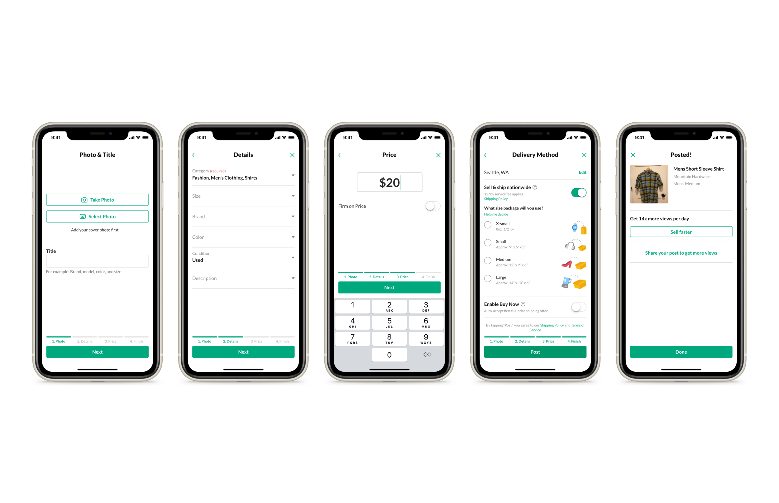
Search and browse introduced Early Access inventory. Item detail explained the advantage before a buyer contacted a seller. Messaging, inbox, and profile surfaces used Premium identity as a signal of trust and commitment. Post and selling flows introduced promotion and visibility benefits.
Each entry point could lead into a consistent subscription experience, but the message began with the customer’s immediate goal.
[IMAGE BREAK — CONTEXTUAL ENTRY-POINT GALLERY]
BUILDING VALUE PROGRESSIVELY
We introduced and tested benefits incrementally rather than launching an unproven bundle all at once:
1. Ad-free experience and Premium badging
2. Early Access to new listings
3. Listing promotions that moved an item higher in the feed
4. Increased feed visibility for Premium sellers
Each additional benefit produced a meaningful increase in signups. The program demonstrated that customers were not subscribing to a label. They were subscribing to practical advantages in the marketplace.
[IMAGE BREAK — VALUE-PROPOSITION TESTING SEQUENCE]
OUTCOME
The entry-point system transformed Premium from a destination into a layer of the marketplace experience. Customers could encounter it while solving real problems, and the team gained a repeatable framework for connecting new benefits to the surfaces where they mattered most.
The work also created a visual and interaction foundation that could grow with the subscription instead of requiring a new acquisition pattern for every feature.
[IMAGE BREAK — CUSTOMER MOMENT TO CONSISTENT PREMIUM EXPERIENCE]
WHAT THIS DEMONSTRATES
• Systems thinking across a complex, two-sided marketplace
• Customer-centered growth design
• Cross-functional leadership across multiple product surfaces
• Research translated into product positioning and interaction design
• Visual direction and product identity leadership
• Experimentation without fragmenting the customer experience