


1
2
3
4
5
6
7
8
9
10
11
12
13
14
15
Problem Solving
Problem:
Currently Eat24 has a bounce rate of 80%. How, through redesign, can we reduce the bounce rate to 25% and at the same time increase the amount of restaurants served to 1 million nation-wide?
I approached the design through user research and user testing first, before developing any design, or wireframes. After sitting with the user(s) and listening to their needs, I crafted the mobile app first and moved on to the desktop second.
Business Goals:
Goal 1: Decrease the bounce rate to 25%.
Goal 2: Increase restaurants served nation-wide to 1 million.
User Goals:
Goal 1: Decrease user stress when ordering food online.
Goal 2: Provide order tracking to reduce user stress and unhappiness.
Goal 3: Allow the user to personalize their experience for faster service.
Task Tracking Board
After compiling and analyzing the research, I created this task board to track each task my users wanted to perform at each step of the ordering process. This enabled me to quickly reference what was needed for each page, and helped visualize which tasks were page specific and which were needed at multiple steps of the process. I often found myself sketching over it to make slight adjustments.
Landing Page
The existing Eat24 landing page was cluttered and confusing. The goal of the redesign was to to clean it up and focus the user on the onboarding process and do what they came for: Find food!
This page also included a secondary call to action (CTA) button for onboarding restaurants, a primary business goal of Eat24.
Restaurant List Page
The goal of the list page is to show as much information as possible without clutter, allowing the user to make informed choices quickly.
Restaurant Map Page
The map page allows the user to easily see which restaurants are nearest their current location. During testing users loved having this option and easily understood toggling between list and map views.
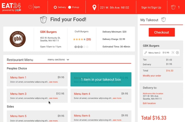
Menu Page
After the redesign, users can easily find where they are in the process at each step along the way. I accomplished this by continually asking test users where they were in the process and making changes, such as adding process headers, until users reported no confusion. Design, test, design, test!
Sign Up Page
The sign up page allows the user to log in if they already have an account, log in with email and password, or use social media credentials. My research showed that the maggie millennial persona preferred the social media credentials while other personas preferred email log in.
Checkout Page
The checkout page is designed to simplify a process that is often a point of frustration for users. In addition to the standard credit card option, users can choose an online wallet like Google or Paypal. Users can also edit their orders here before paying. After testing I added the "no tip" option in response to user input.
From this page the user can also edit their order and make changes to quantity and order details.
Tracking Page
The tracking page is a new feature I added to Eat24 to eliminate the frustration point ofwaiting for your food to arrive.